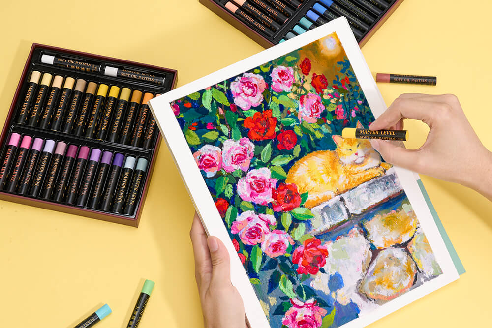
Choosing your first set of oil pastels can be exciting — opening a box full of colors and imagining what you will create is part of the fun.
But many beginners quickly discover that not every oil pastel feels the same. Some colors are difficult to blend, some feel too hard on paper, and some sets make it challenging to achieve the smooth, painterly effects that attracted you to oil pastels in the first place.
The difference often comes down to the quality of the materials and how the pastels respond when you layer, blend, and build colors.
For beginners, the right set should make the learning process easier. A creamy texture, rich pigments, and a balanced color selection can help you focus less on fighting the material and more on exploring your creativity.
In this guide, we’ll share what to look for when choosing oil pastels for beginners, how to get better results from your first drawings, and how to select a set that matches your creative goals.
What Should Beginners Look for in Oil Pastels?
Not all oil pastels feel the same. Some are rock-hard and feel like you're dragging a candle across the page. Others are so soft they crumble the second you touch paper.
For beginners, you want something in the middle. A stick that's soft enough to blend easily but firm enough to control.
Here's what I tell people to check before buying:
Application. Does it glide across paper or drag? Good oil pastels feel smooth from the first stroke.
Color payoff. Can you see rich color with one light pass, or do you need to press hard and go over it multiple times? Cheap pastels make you work for color. Good ones deliver it.
Layering. When you put one color on top of another, does it sit there cleanly or does it push the first layer around? This matters more than you'd think.
Blending. Can two colors merge naturally, or do they just sit next to each other looking awkward?
If you're starting out and pick a set that does all four reasonably well, you'll save yourself a lot of frustration.

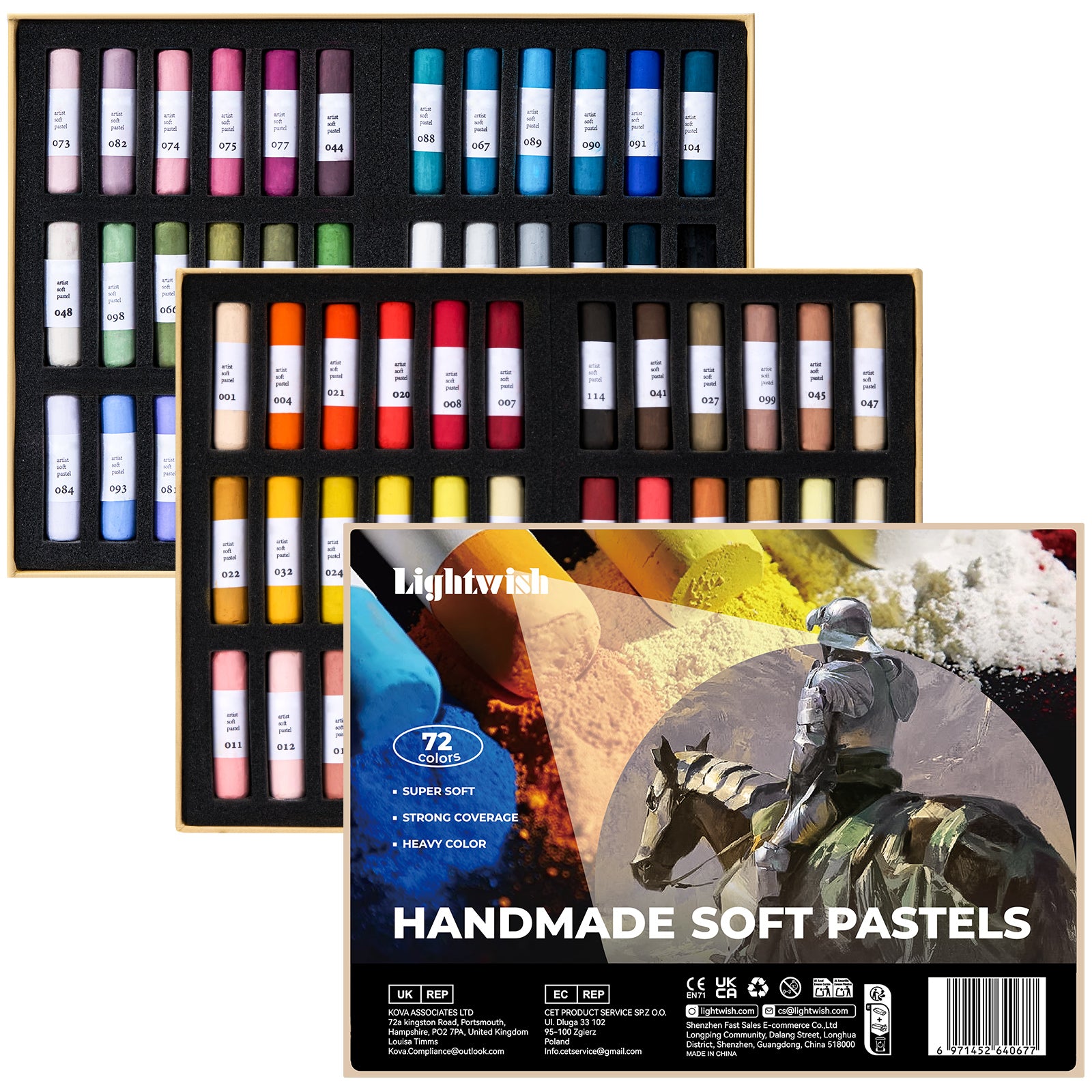
That's where LIGHTWISH comes in. The formula is creamy — not too hard, not too soft — and the pigment load is high enough that you don't have to fight the stick to get color on paper.
👉[Link to LIGHTWISH Oil Pastels Collection]
Why Pigment Quality Changes Everything
One thing many beginners discover after trying different oil pastels is that pigment quality makes a noticeable difference.
A pastel stick is mostly made of two things: pigment and binder. Pigment gives you color. Binder holds it together. Cheap oil pastels use a lot of binder and very little pigment. That's why they feel waxy and look pale.
Good ones? The opposite. More pigment, less binder. That means richer color, easier mixing, and better contrast.
Think about it this way: if you're painting a sunset, you might layer orange, pink, purple, and white to get that smooth transition. With pigment-rich oil pastels, those layers build beautifully. With cheap ones, each layer just smears the one underneath.

LIGHTWISH oil pastels are heavily pigmented. That's not just marketing — it's the reason they perform the way they do. You can get vibrant results without pressing hard, and that makes learning a lot more forgiving.
👉[Link to LIGHTWISH Oil Pastels Collection]
How to Use Oil Pastels: Start With Layers, Not Pressure
The most common mistake? Pressing too hard.
This is a common habit for beginners because pressing harder often feels like the easiest way to get stronger color. You think more pressure equals more color. But with oil pastels, it actually does the opposite. Heavy pressure pushes the binder to the surface and makes everything look waxy and uneven.
The fix is simple: lighten up. Literally.
Instead of bearing down, try this:
1. Start with a very light layer. Just enough to get color on the paper.
2. Add a second color nearby, also light.
3. Overlap them gently where you want them to blend.
4. Keep building layers until you get the saturation you want.
The more you practice this approach to using oil pastels, the more natural it becomes. You'll probably forget and press hard again — I still do sometimes. But when you get it right, the difference is night and day.
How to Blend Oil Pastels for Smooth Transitions
Blending is where this medium really shines. The creamy texture lets colors interact directly on the page in ways that other drawing materials just can't match.
Here are a few ways to blend oil pastels:
Finger Blending
Using your finger is the simplest method. Your body heat softens the pastel and helps colors merge. It's great for backgrounds, skies, flower petals, and soft shadows.
Just keep a paper towel handy unless you want rainbow fingertips. I've learned that the hard way.
Layer Blending
Instead of rubbing colors together, build them gradually on top of each other. Cleaner results, but takes more patience. Let the first layer sit, then add the second on top and blend just the edges where they meet.
White Blending
White is basically a cheat code. A layer of white over two colors smooths everything out and creates that soft, painterly look. That's why LIGHTWISH includes extra white sticks — because once you start using white this way, you'll go through it fast.

If you're stuck and want to see improvement quickly, try this: pick two colors that don't seem like they'd work together. Lay down one lightly. Add the other next to it. Blend where they meet with a third color (or white). You'll probably be surprised how good it looks.
Essential Oil Pastel Techniques to Practice as a Beginner
Learning a few simple methods can quickly improve your artwork. Oil pastels are a flexible medium, and the same stick can create completely different effects depending on how you apply it.

Layering Colors
Build color slowly, one layer at a time. This is how you get depth and richness. Works for landscapes, flowers, portraits — basically everything.
Creating Texture
Change your pressure on purpose. Press lightly for soft backgrounds, harder for highlights and details. You can also use the side of the stick for broad coverage and the tip for fine lines. One of the best things about oil pastels is how versatile they are — a single stick can give you completely different effects.
Scumbling
This one's fun. Use short, circular strokes to overlap colors without fully blending them. The result is a broken-color effect that looks energetic and textured. Great for foliage, water, or anything that benefits from a bit of visual chaos.
Honestly, this kind of oil pastel painting practice is where the learning really happens. You're not trying to make something perfect — you're just exploring what the material can do.
How Many Colors Do You Actually Need?
A question I get a lot: "How many colors do I really need?"
Depends on what you want to paint.
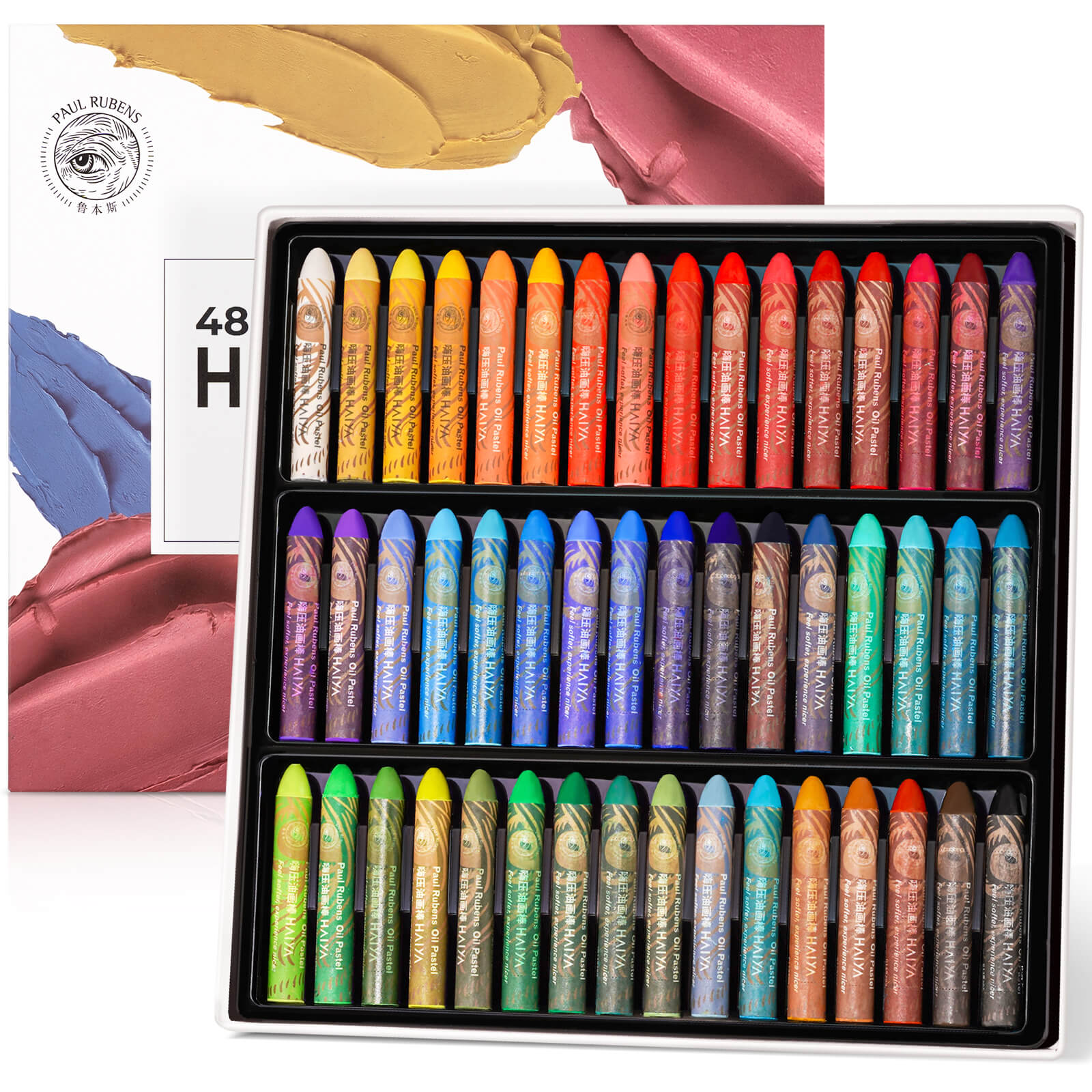
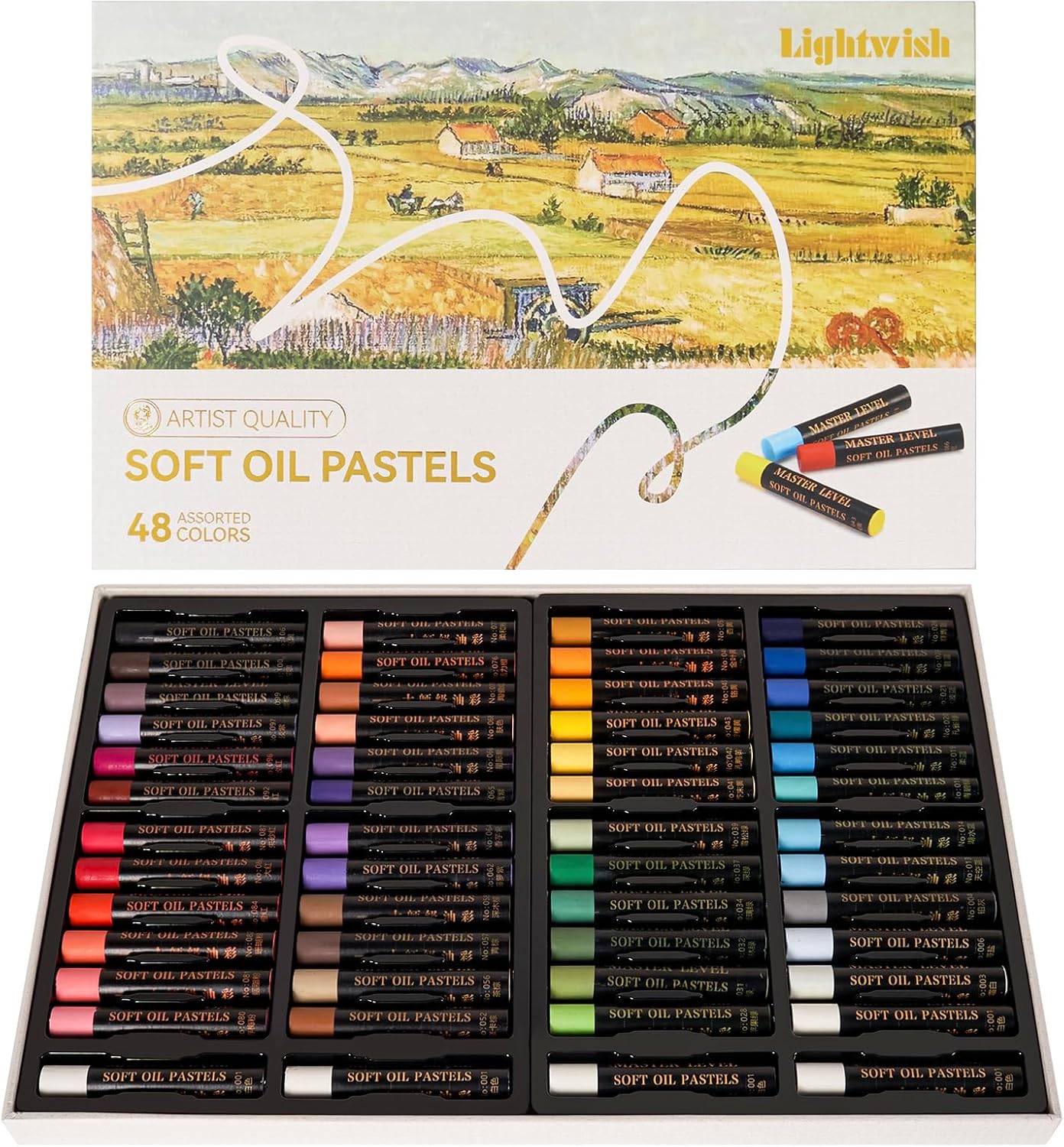
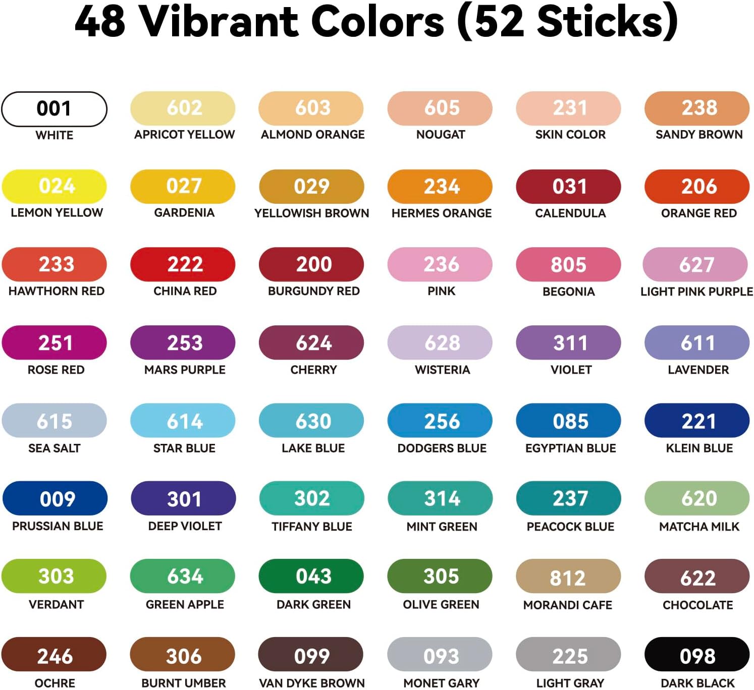
48 Colors + 4 White
A solid starting point. You get enough variety to practice without feeling overwhelmed. Works for landscapes, simple illustrations, color mixing practice. Extra white sticks for blending and highlights.
77 Colors + 1 White
Leans toward nature — more greens, pinks, purples. If you're drawn to oil pastel flowers or botanical subjects, this is a good fit. The palette feels curated rather than random.
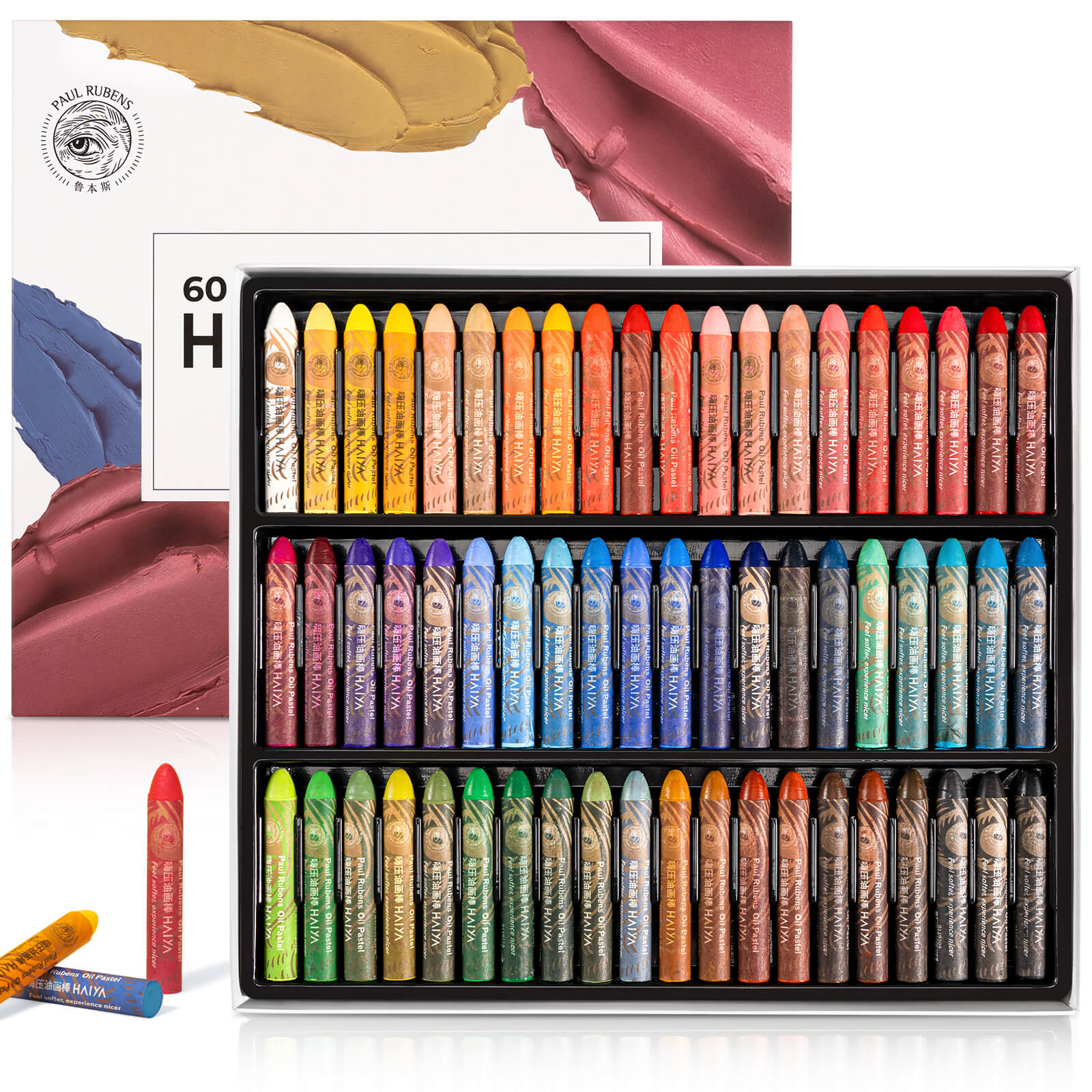
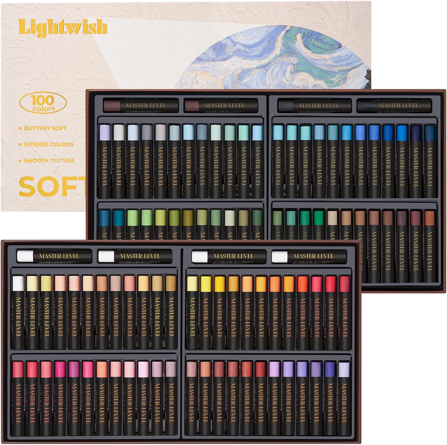
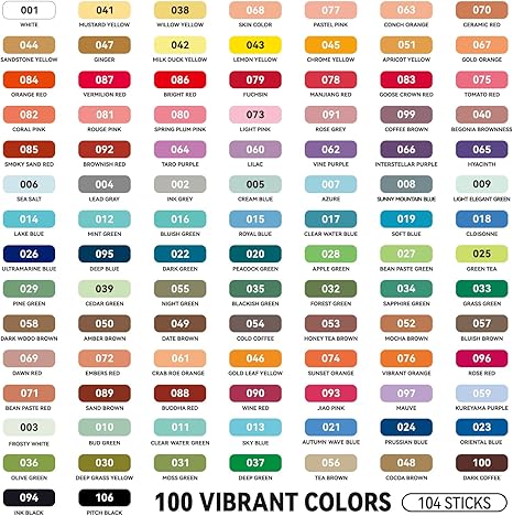
100 Colors + 4 White
Maximum flexibility without needing to mix everything from scratch. Portraits, detailed work, complex landscapes — you'll have options. And again, extra white sticks for when you need them.
For most beginners, starting with a smaller but well-balanced set is often the better choice. Start with 48 if you're unsure. You can always add more colors later. The quality matters more than the quantity.

Oil Pastel Ideas for Your First Projects
The blank page is intimidating. Here are three subjects that make starting easier.
Sunset Landscape
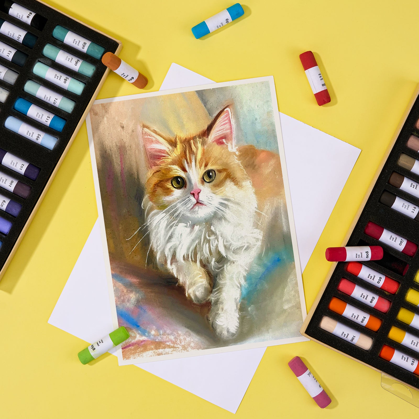
A classic first project. You can practice gradient blending without worrying about precision. Pick two or three warm colors and see how they merge.
Flower Artwork
One bloom, not a whole garden. Focus on soft edges and color variation. This is how you learn to use oil pastels for flowers — starting small and building up 
Abstract Color Studies
No rules. Just experiment with texture, movement, and color combos. Some of the best learning happens when you're not trying to make something "look like" anything.
Don't worry about creating a masterpiece. The goal is to make strokes, learn what works, and build confidence. That's it.
Frequently Asked Questions
Are oil pastels easy to blend?
If they're soft enough, yes. The creamier the formula, the easier the blending. Lighter pressure and gradual layers also help.
What's the difference between oil pastels and crayons?
Crayons are mostly wax and binder. Oil pastels use more pigment and an oil binder. That means better color, smoother application, and actual blending ability. Completely different tools.
Are oil pastels lightfast?
High-quality oil pastels use carefully selected pigments that are evaluated for color stability. LIGHTWISH oil pastels have been tested for lightfastness according to Blue Wool Scale standards, helping ensure reliable color performance and vibrancy. Like all artwork, the long-term appearance of finished pieces can also be affected by factors such as lighting conditions, display environment, and the surface used.
What paper should I use?
Look for paper with texture — "tooth" is the technical term. Pastel paper, sanded paper, or heavy watercolor paper (140lb+) all work. Smooth paper limits your layering and blending.
Can I use oil pastels on canvas?
Yes. Primed canvas works well. The texture adds interest, and the pastel grips the surface nicely.
Do oil pastels need fixative?
Oil pastels don't produce dust the way soft pastels do, so fixative isn't required. If you're framing your work, glass will protect it from accidental smudging.
Final Thoughts
Oil pastels are one of the most forgiving mediums out there. They don't need special equipment. They don't require long drying times. And honestly? They're just fun to use.
But the experience does depend on what you start with. A set that's too hard or under-pigmented can make learning feel like a struggle. A set that's creamy, responsive, and well-made? It makes everything easier — blending, layering, mixing, experimenting.
LIGHTWISH oil pastels are built with that in mind. High pigment content. Smooth application. Colors that actually do what you want them to. Whether you're working on your first landscape, experimenting with abstract textures, or just messing around with color combinations, they won't get in your way.
👉[Link to LIGHTWISH Oil Pastels Collection]
P.S. If you're still on the fence, grab a smaller set and practice one technique at a time. A single good session can change how you feel about the whole medium. Many artists discover this as they spend more time experimenting with the medium.