So, you're ready to try watercolor painting? Great choice! It can be a great way to make money, but it can also be really frustrating. One of the first things you need to learn is how to choose a set of watercolor paints. It's not just about picking pretty colors (though that is part of the fun!), it's about understanding pigments, how well colors stand up to light, and creating a set of colors that works well with your artistic style. A well-chosen palette is key to making your painting look its best.
We're going to explain everything, from understanding the different types of palettes to selecting colors that you really like. We'll teach you everything you need to know to confidently go to an art store (or browse online) and pick out the perfect paint set for you. Are you ready? Let's start painting!
1. Decoding Watercolor Palettes: A Beginner's Best Friend
Alright, let's start with the basics. Watercolor palettes come in all shapes and sizes, materials and configurations. It can feel overwhelming, I know! But don't fret, we'll untangle this knot in no time.
Understanding Palette Types
- Plastic Palettes: These are your bread-and-butter, often the most affordable option. They come in various sizes and can be easily cleaned (though staining can be a bummer). Look for palettes with deep wells for mixing larger washes.
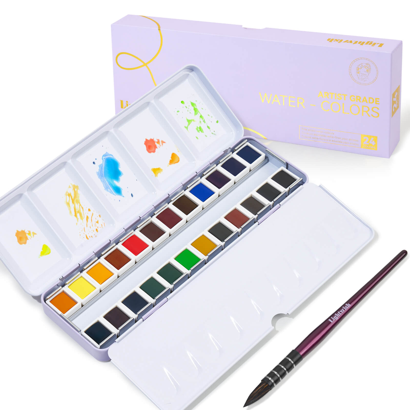
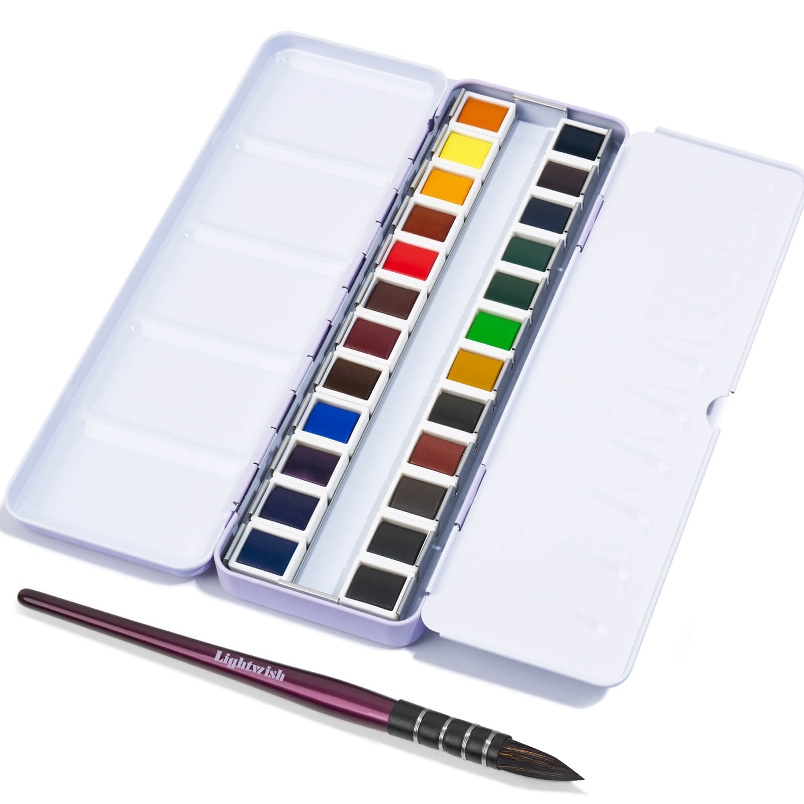
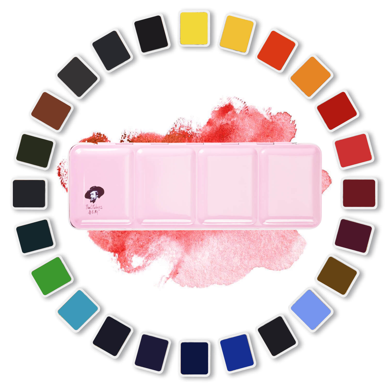
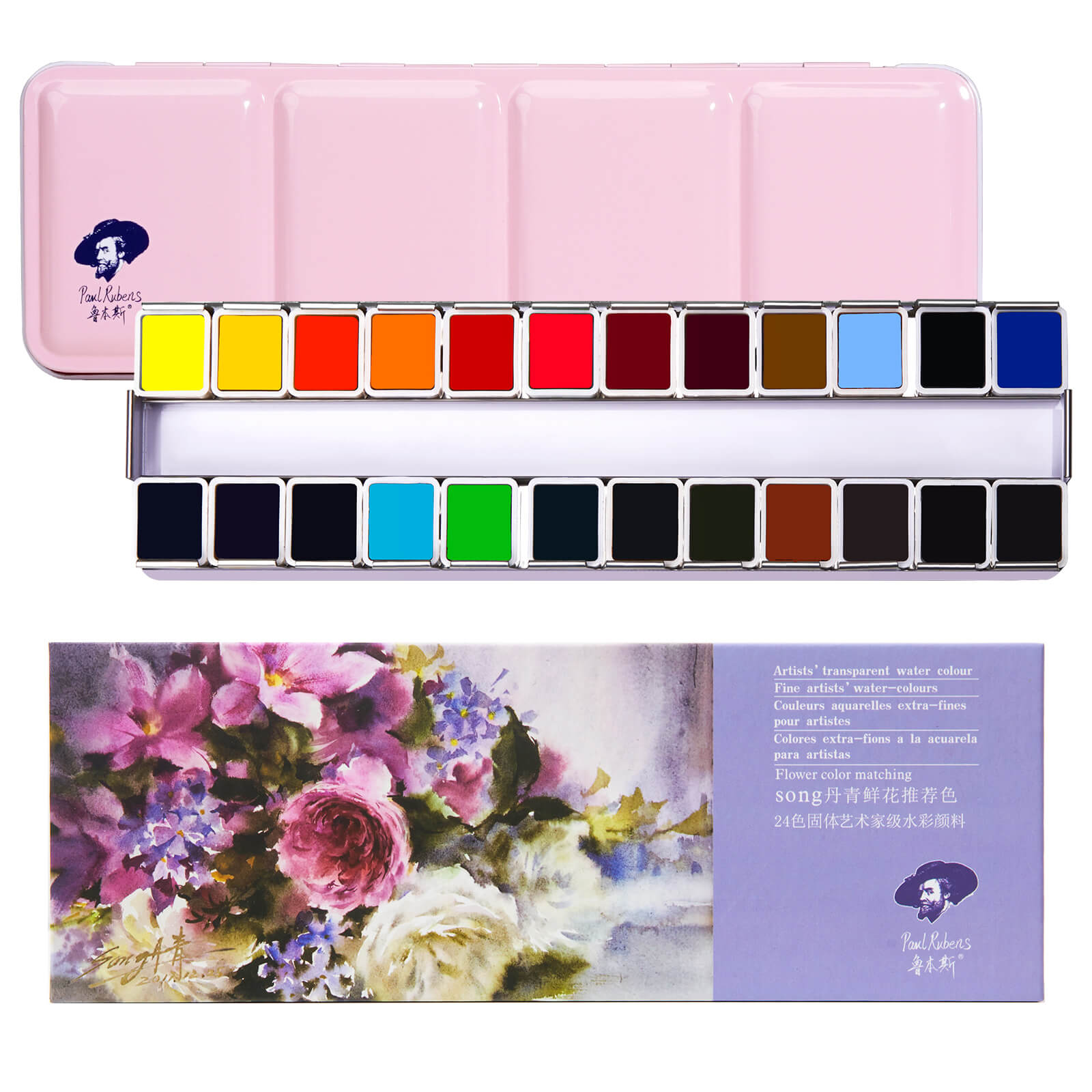
- Metal Palettes: Usually enameled, these offer a smoother surface and can often be repurposed tin boxes. They're a bit more durable than plastic. Some even come with magnetic strips, allowing you to customize with individual paint pans. Fancy!
- Porcelain Palettes: The crème de la crème! Porcelain is non-staining, easy to clean, and provides an excellent surface for seeing true color. They tend to be pricier and more fragile, but oh-so-worth it if you’re serious about your watercolor journey.
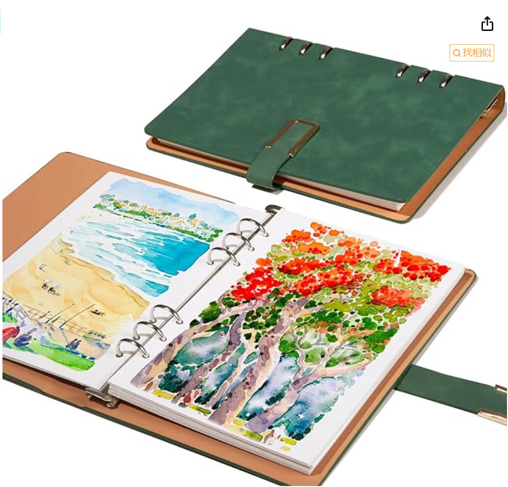
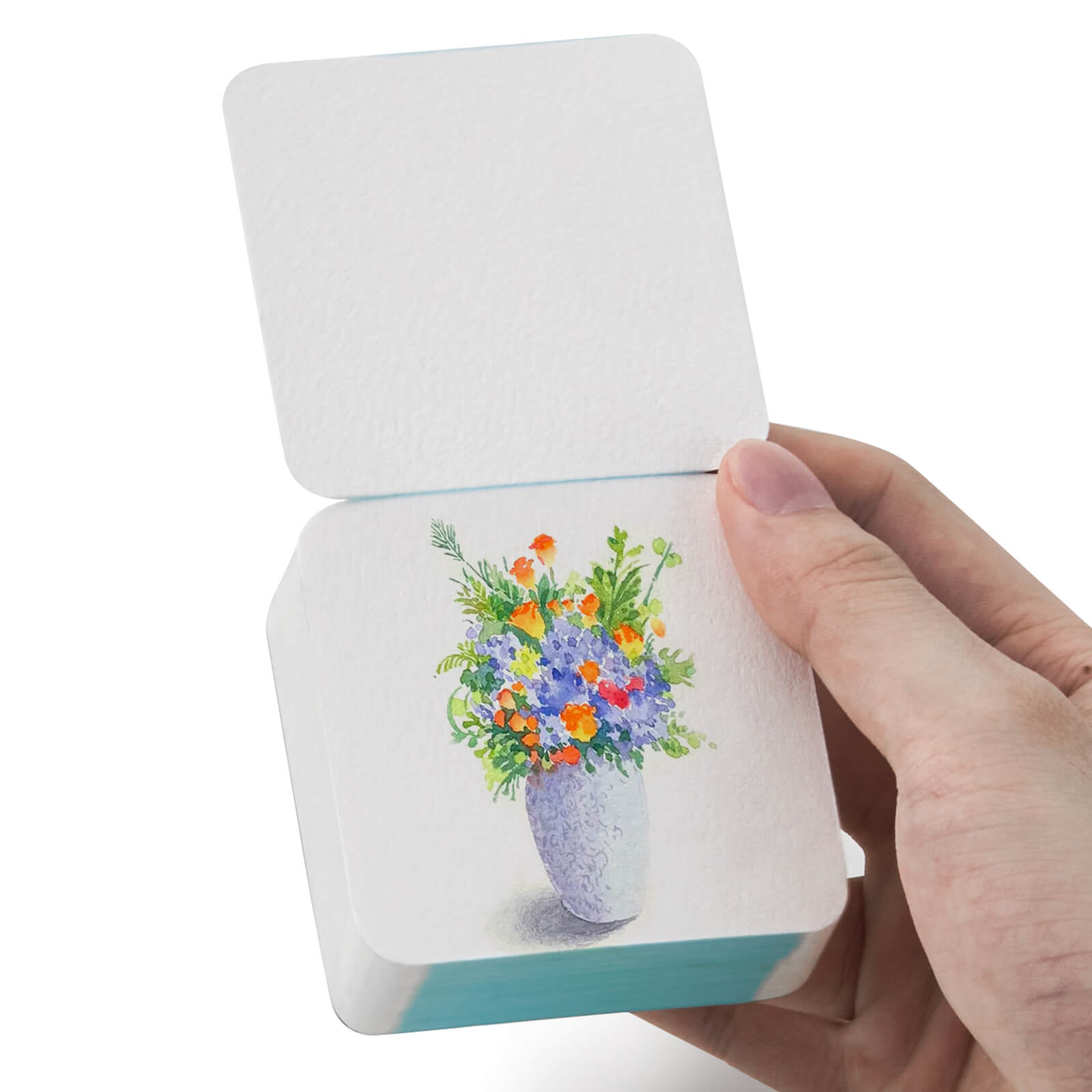
- Folding Palettes: These are perfect for travel or plein air painting. They usually have hinged sections that open to reveal mixing wells and space for pans or tubes. Talk about convenient!
- Wet Palettes: These are specifically designed to keep your watercolors moist for longer periods. They usually consist of a sponge or absorbent paper layer that's kept damp. Ideal for preventing those frustrating dried-up paint situations.
- Wooden Palettes:
Pre-Filled vs. Empty Palettes: The Great Debate
This is where things get personal. Do you opt for a pre-filled palette with a curated selection of colors, or do you go rogue and build your own from scratch?
- Pre-Filled Palettes: A fantastic option for beginners! They take the guesswork out of color selection and often come with a good range of basic hues. However, you're stuck with the colors they’ve chosen, which might not perfectly align with your artistic vision.
- Empty Palettes: Offer complete freedom! You get to hand-pick every single color, tailoring your palette to your specific needs and preferences. This requires a bit more research and understanding of pigments, but the payoff is a truly personalized palette.
2. Color Theory Crash Course: More Than Just Pretty Hues
Okay, let's talk color! Understanding basic color theory is crucial for how to choose a watercolor palette that will actually help you create the art you envision.
The Color Wheel: Your Artistic Compass
Remember the color wheel from art class? It's not just a pretty circle! It's a roadmap to understanding color relationships.
- Primary Colors: Red, Yellow, Blue – the foundation of all other colors.
- Secondary Colors: Orange, Green, Violet – created by mixing two primary colors.
- Tertiary Colors: Created by mixing a primary and a secondary color (e.g., red-violet).
- Complementary Colors: Colors that sit opposite each other on the color wheel (e.g., red and green). Using complementary colors creates contrast and visual excitement.
Pigment Properties: The Secret Sauce
Not all watercolors are created equal. Understanding pigment properties is key to making informed choices.
- Lightfastness: How resistant a pigment is to fading over time when exposed to light. Look for pigments with a high lightfastness rating (usually indicated by stars or Roman numerals on the paint tube). You don’t want your masterpiece turning into a ghost in a few years!
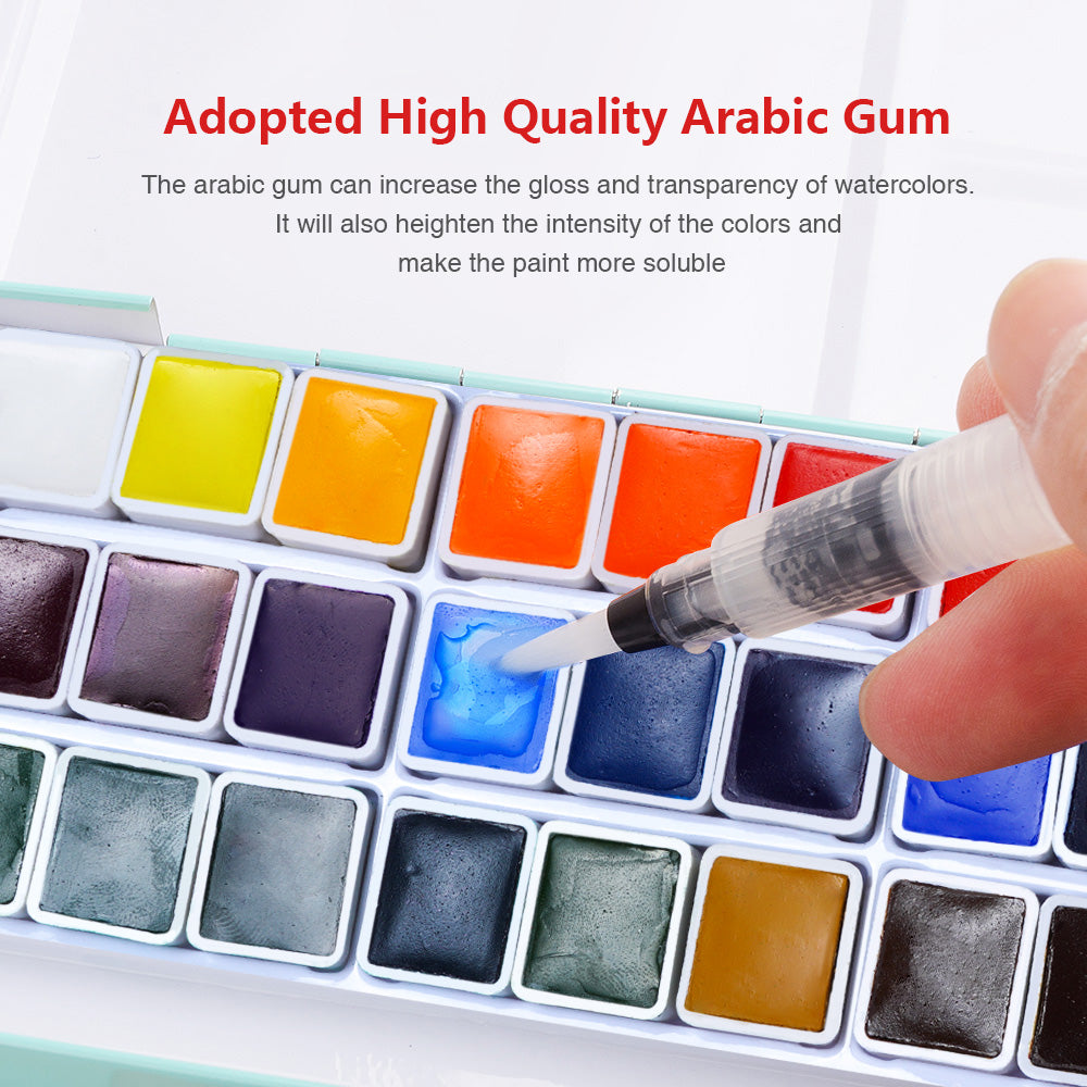
- Transparency: How much light passes through the pigment. Transparent watercolors are great for layering and creating luminous effects.
- Opacity: How much the pigment obscures what's underneath. Opaque watercolors are good for covering up mistakes or creating flat, solid areas of color.
- Granulation: The texture of the pigment when it dries. Granulating pigments create a beautiful, mottled effect. Some artists love it, some hate it – it’s a matter of personal preference.
- Staining: How much the pigment stains the paper. Staining pigments are difficult to lift or remove, while non-staining pigments are more forgiving.

Building Your Palette: Essential Colors and Beyond
So, what colors should you actually put on your palette? Here’s a suggestion, but feel free to adjust based on your personal preferences!
-
A Warm and Cool of Each Primary Color: This gives you the flexibility to mix a wider range of colors. For example:
- Red: Cadmium Red Light (warm), Alizarin Crimson (cool)
- Yellow: Cadmium Yellow Light (warm), Hansa Yellow Light (cool)
- Blue: Ultramarine Blue (warm), Phthalo Blue (cool)
-
Earth Tones: These are essential for landscapes and adding depth and realism.
- Burnt Sienna
- Raw Umber
- Yellow Ochre
- A Versatile Green: While you can mix greens, having a pre-mixed green on hand can be convenient. Sap Green is a good option.
- A Neutral Tint: Payne's Gray or Neutral Tint are useful for darkening colors and creating shadows.
Don't be afraid to experiment! Try different colors and see what works best for you. There’s no “right” or “wrong” answer, just what resonates with your artistic style.
3. Advanced Palette Strategies: Beyond the Basics
Ready to level up your palette game? Let's explore some more advanced strategies.
The Limited Palette: Mastering More with Less
A limited palette consists of only a few colors, forcing you to mix and blend to create a wider range of hues. This can be a fantastic way to improve your color mixing skills and create harmonious paintings. The Zorn Palette (Yellow Ochre, Cadmium Red, Ivory Black, and White – though white isn’t traditionally used in watercolor) is a popular example.
Thematic Palettes: Painting with Purpose
Consider building palettes based on specific themes or subjects. For example:
- Landscape Palette: Focused on greens, browns, and blues.
- Portrait Palette: Focused on skin tones and subtle variations in color.
- Abstract Palette: Whatever colors inspire you!
Customizing Your Palette: Making it Truly Yours
Don’t be afraid to break the rules! Add unusual colors, experiment with different brands, and find what works best for you. Your palette is a reflection of your artistic personality, so make it your own!
4. Keeping Your Palette Happy: Maintenance and Care
A well-maintained palette is a happy palette! Here are a few tips for keeping your colors vibrant and your palette in good shape.
- Clean Your Palette Regularly: Wipe down your palette after each painting session to prevent colors from mixing and becoming muddy.
- Reactivate Dried Watercolors: Dried watercolors can be easily reactivated with a few drops of water.
- Store Your Palette Properly: Keep your palette out of direct sunlight to prevent fading.
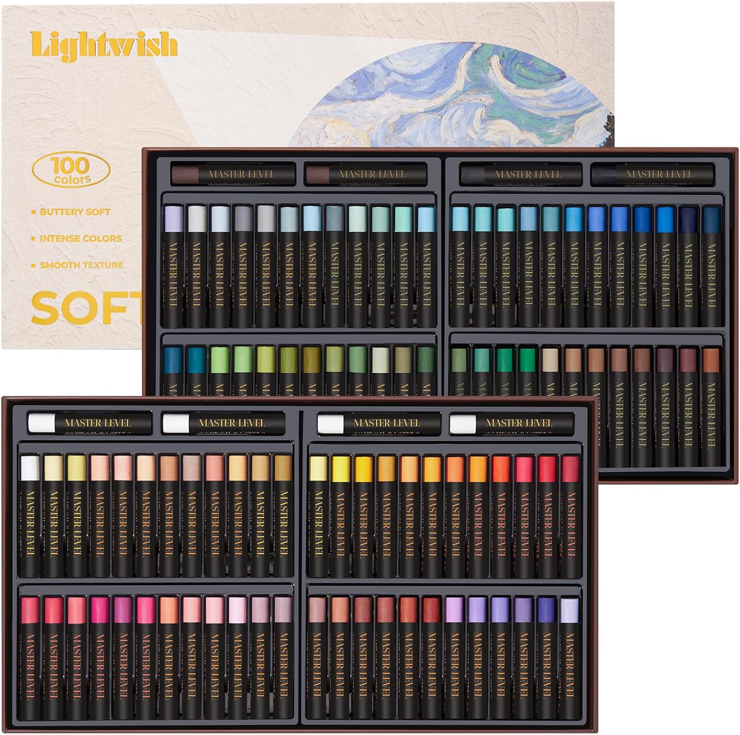
5. Wooden Palettes: A Deeper Dive into Delight
Okay, let's talk wood! There's something undeniably charming about a wooden palette. It feels good in your hand, ages beautifully, and adds a touch of natural elegance to your workspace. But are they practical? Absolutely!
Choosing the Right Wood
Not all wood is created equal when it comes to palettes. Here's what to consider:
- Hardwoods: Oak, maple, walnut, and cherry are all excellent choices. They're durable, resist warping, and have a beautiful grain.
- Softwoods: Pine and fir are more affordable, but they're also more prone to staining and warping. They’re perfectly fine for beginners though!
- Sealed vs. Unsealed: This is a crucial decision. An unsealed wooden palette will absorb water and pigments, which can be both a blessing and a curse. Some artists love the way it helps keep paints moist, while others find the staining frustrating. A sealed palette will be more resistant to staining and easier to clean, but it won't have the same moisture-retaining properties.
- Avoid: Wood that is overly porous or has large knots, as these can interfere with mixing.
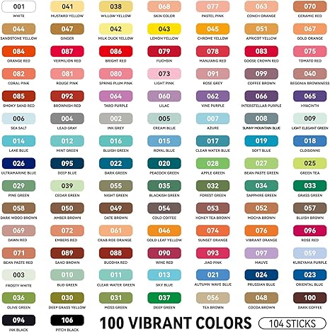
Lightwish Wooden Watercolor Palette:

Types of Wooden Palettes
- Traditional Flat Palettes: These are simple, flat surfaces, often rectangular or oval. They’re great for artists who prefer a minimalist approach.
- Palette Boxes: These feature a wooden box with a hinged lid that serves as the palette surface. They’re perfect for storing paints and brushes.
- Thumbhole Palettes: These have a thumbhole for easy holding. They’re ideal for plein air painting or working while standing.
- Custom-Made Palettes: This is where the magic happens! You can have a wooden palette made to your exact specifications, with the size, shape, and features you desire. Talk about ultimate control!
6. FAQs: Your Burning Questions Answered
-
Q: Can I mix different brands of watercolor paints?
- A: Absolutely! Feel free to mix and match brands to find the colors and properties you prefer. Just be aware that different brands may have slightly different pigment properties.
-
Q: What's the best way to clean a stained plastic palette?
- A: While some staining is inevitable, you can try using a gentle abrasive cleaner like baking soda paste.
-
Q: Should I buy pans or tubes?
- A: It's mostly personal preference. Pans are convenient and portable, while tubes allow you to squeeze out fresh paint and control the consistency. Many artists use both!
-
Q: Is it okay to use cheap brushes with artist-grade paints?
- A: While you can, using high-quality brushes will improve your painting experience. Good brushes hold more water, release paint more smoothly, and last longer.
7. Conclusion: Embrace the Colorful Chaos!
Choosing a watercolor palette is a journey, not a destination. Don't be afraid to experiment, make mistakes, and discover what works best for you. The most important thing is to have fun and let your creativity flow! By understanding the basics of color theory, pigment properties, and the different types of palettes available, you'll be well on your way to creating stunning watercolor masterpieces. So go forth, paint with abandon, and embrace the colorful chaos! You got this! And remember, when in doubt, just keep asking yourself, "How to choose a watercolor palette?" – and come back here for a refresher! Happy painting!

1 comment
Julie D
I appreciate how you listed off the warm and cool colors appropriate for color mixing, but it would have been more valuable if you had included their pigment component numbers. I purchased a 48 color set and only find one of the colors listed below. I could have at least looked for a close match with the pigment number.
Red: Cadmium Red Light (warm), Alizarin Crimson (cool) Yellow: Cadmium Yellow Light (warm), Hansa Yellow Light (cool) Blue: Ultramarine Blue (warm), Phthalo Blue (cool)